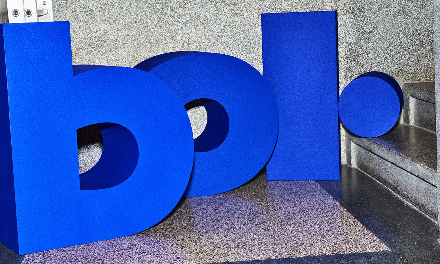
The platform sphere says goodbye to the last part of its name. While Bol had to make it clear almost 25 years ago that it was an online store, this is no longer necessary. The corporate identity will also be refreshed, with a more playful design and use of color. The first campaign in the new style is the living campaign that can be seen from October. The brand update will be gradually implemented in all communications over the coming years. The old visual style will also be regularly visible, for example on packaging, because it is not simply thrown away.
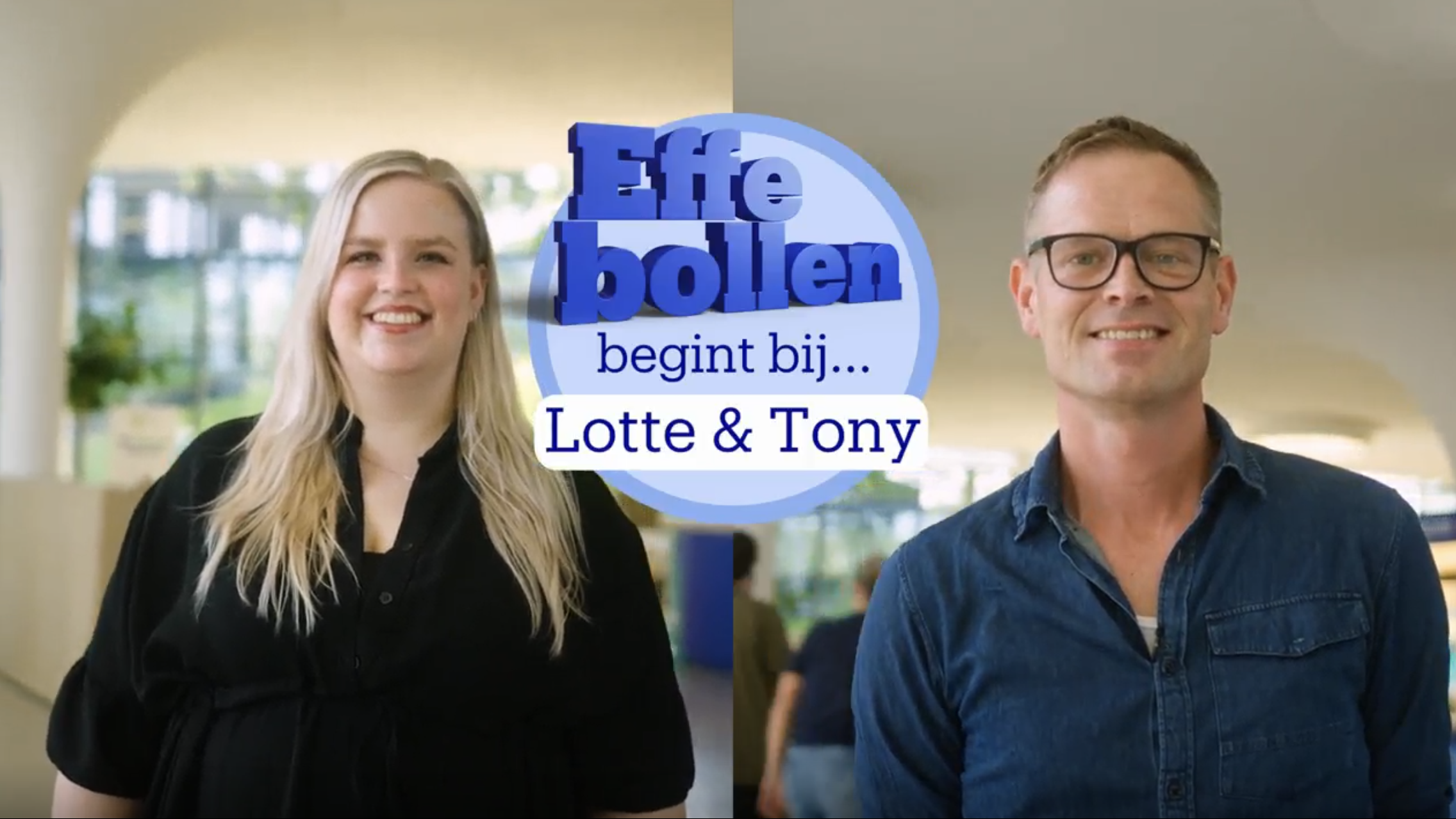
Boukje Taphoorn, Chief Marketing & Sustainability Officer at bol: 'We are now so much more than a website, also an app and also active on social media channels. We feel more bol.com than bol.com. And most importantly, customers already call us that. It is already used informally, we are now making it official.'
Visual identity adjustments
Not only the brand name changes, the visual style has also been subtly adjusted. This is reflected, among other things, in more playfulness in typography, photography and an expansion in the use of color. The recognizable blue of the ball remains. Customers will see the new corporate identity in the app, on the website, in campaigns, on the gift card and on packaging.